
For those times when you need to select a subset of a data table in Excel 2013 as the range to be charted (as opposed to selecting a single cell within a data table), you can use the new Quick Analysis tool to create your chart. Just follow these steps:
Click the Quick Analysis tool that appears right below the lower-right corner of the current cell selection.
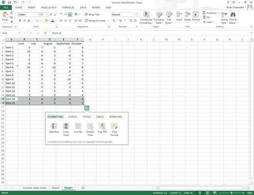
Doing this opens the palette of Quick Analysis options with the initial Formatting tab selected and its various conditional formatting options displayed.
Click the Charts tab at the top of the Quick Analysis options palette.
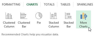
Excel selects the Charts tab and displays the chart option buttons. The first five chart type buttons preview how the selected data in a different type of chart will look.
The final More Charts button opens the Insert Chart dialog box with the Recommended Charts tab selected. Here you can preview and select a chart from an even wider range of chart types.
In order to preview each type of chart that Excel 2013 can create using the selected data, highlight its chart type button in the Quick Analysis palette.
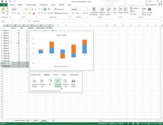
As you highlight each chart type button in the options palette, Excel’s Live Preview feature displays a large thumbnail of the chart that will be created from your table data. This thumbnail appears above the Quick Analysis options palette for as long as the mouse or Touch Pointer is over its corresponding button.
When a preview of the chart you actually want to create appears, click its button in the Quick Analysis options palette to create it.
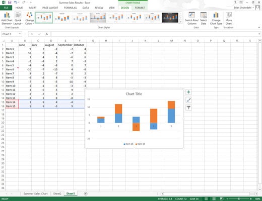
Excel 2013 then creates a free-floating chart (called an embedded chart) within the current worksheet. This embedded chart is active so that you can immediately move it and edit it as you wish.