
Sometimes, despite the best intentions and competent technique, you end up with digital pictures that have bad color. Perhaps the picture has a green color cast caused by fluorescent lights, or it has too much red because you took it late in the day. Fortunately, image editors, such as Photoshop, let you fix these.
You have a lot of tools at your disposal. Some of these tools are easy to use, but others take a little practice.
Before you get started, keep in mind that you can’t add color that isn’t there in the first place. If your image is way too red, you can’t compensate by adding its opposite color (cyan). Image editors work by subtracting hues.
So, if your picture is dominated by red and has very little green or blue, when you remove the excess red, you don’t end up with a correctly balanced image. You wind up with a picture that’s grayish because a little bit of red, blue, and green is all that’s left.
Photoshop’s color-correcting tools include the following:
Auto Color: This is another one of those pesky “auto” controls that uses Photoshop’s guesswork to provide a possible correction to your color problems. Most likely, though, the correction isn’t what you want.
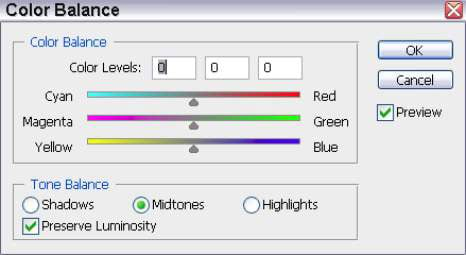
Color Balance: To access the Color Balance sliders, press Ctrl+B on a PC, Command+B on the Mac. The sliders let you seemingly add red, green, or blue while subtracting their complements (cyan, magenta, and yellow).
You can use the sliders while viewing your image to make color corrections. Of course, you can’t really add a color to an image; the dialog box’s operation just gives you an easier-to-understand representation of what’s really going on. When you move the Red/Cyan slider to the right, Photoshop actually subtracts cyan.
If you move it to the left (to “add” cyan), you’re really subtracting red. If you understand what’s going on, you aren’t really fooled, but you don’t mind, either. The same thing takes place when you adjust the Magenta/Green and Yellow/Blue sliders. The Color Balance dialog box allows you to apply these color changes to the highlights, midtones, and shadows.
Hue/Saturation: This control (which you can access by pressing Ctrl+U on a PC, Command+U on the Mac) changes color by using different components than the standard Color Balance tools use. Instead of modifying the primary colors of light, it adjusts the overall color of the image (hue), how pure or rich the colors are (saturation), and the lightness or brightness of the color.
Moving the Hue slider rotates the color clockwise or counterclockwise around the edges of the color wheel (you don’t see this color wheel in the dialog box). The Saturation slider adds richness, turning a muted pink into a deep rose or dark red, for example.
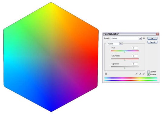
The Brightness slider controls the overall luminosity of the image; you probably don’t often need to use this slider. All versions since Photoshop CS5 have a Presets option that allows you to store saturation settings and apply them to any photograph.
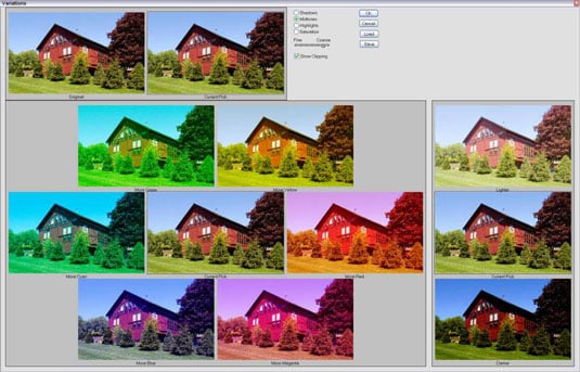
Variations: The Variations dialog box gives you a way to compare different color and darkness alternatives for an image. You get to choose the one that looks best.
Curves: You can use this complex tool for more than adjusting basic (grayscale) tonal values. You can actually control the tonal rendition of each of the primary colors in an image. Using the Curves tool in this way usually requires a lot of experience unless you’re very adventuresome.
Use whichever combination of color-correction tools works for you. They all have particular advantages and disadvantages.