
You will need to take mobile usage into account when developing your site for SEO. Because a desktop computer monitor and a smartphone are drastically different in size, designing for mobile means that you have to do one of three things:
Build a responsive web design that dynamically adjusts content from desktop format to mobile format
Use dynamic serving to make the mobile experience device specific and control how mobile content is delivered page by page
Create a separate mobile site designed specifically for mobile users
Currently, responsive design is the mobile-friendly configuration recommended by both Google and Bing.
Option 1: Responsive design
Explained simply, responsive design is a web design technique that uses CSS and a series of coded rules to dynamically adjust the appearance of your desktop content so that it best fits within the screen-size parameters of different mobile devices. Responsive design uses JavaScript and client-side serving to alter the way pages appear in mobile or desktop browsers after the server has already loaded the page.
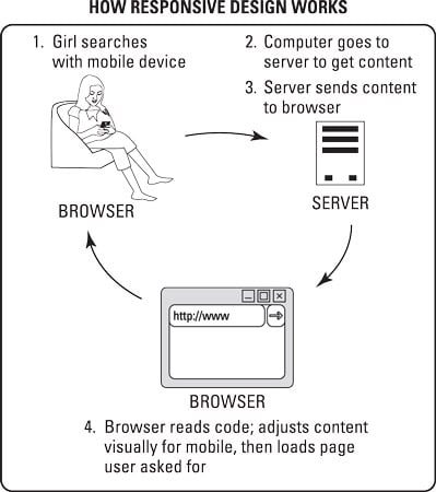
Websites using responsive design have one single set of URLs for all content regardless of whether that content is being delivered to a desktop computer or a mobile device.

When to use responsive design
Choosing responsive design makes sense in the following five circumstances:
When you want a coherent desktop and mobile experience.
When you have a strong desktop website that has built up years of link equity, trust, and industry authority. Responsive mobile sites benefit from shared indexing with desktop sites, which can result in improved mobile ranking.
When you want your desktop and mobile visitors to convert in the same way.
When you have limited development resources, which can make maintaining a custom mobile experience with custom content seem out of the question.
When you want to manage the maintenance and search engine indexing of just one site.
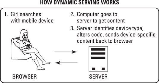
Option 2: Dynamic serving
Dynamic serving is a server-side development approach that detects which type of device your visitor is using to deliver unique content that is optimized specifically for her device.
Like responsive design, dynamic serving uses one single set of URLs for all content regardless of whether that content is being delivered to a desktop computer or a mobile device. But that’s where the similarity ends.
See, responsive web designs dynamically adjust the appearance of content — but the URLs stay the same. With dynamic serving, the URLs stay the same, but the content delivered to mobile devices is not always the same as the content delivered to desktop devices.
This difference in content is possible because dynamic serving is a server-side approach that alters content code based on the device that is asking for it before the content is delivered to the browser. This code allows the server to alter the content of the page without altering the URL of the page.
When to use dynamic serving
Using dynamic serving makes particular sense in the following five circumstances:
When your website needs to include complex mobile-friendly functionality, such as multipage forms or interactive tool dashboards.
When you find that your website needs to serve two different device markets very differently. Some examples are that your iPhone users take a very different path to conversion than your Android users, or you want your pages to render differently for smartphone users than for tablet users.
When your visitors largely use different keywords to access your website via desktop search and mobile search.
When you want your desktop visitors and mobile visitors to convert in different ways.
When you have strong development resources that are comfortable with manually coding and maintaining complex, clean code.
Option 3: Building a separate mobile site
A mobile site is just what it sounds like: a separate website that has been created specifically for mobile device users. With a separate mobile site, users are redirected to a mobile-only version of your website that lives on a unique domain, such as m.domain.com or mobile.domain.com. If you go with this choice, you need to set up your server to detect the device and then send the user to the right site.

An important technical implementation of a separate mobile site is the proper use of canonical tags. From your mobile pages, include a canonical tag that points to the correlated desktop page so that the trust, authority, and link equity of your desktop site will be associated with your mobile site as well. Read more about this in the Google Developers documentation.
When to build a separate mobile site
Here are a few circumstances in particular when it may make the most sense for your business to build a separate mobile site:
When you need to prominently include elements on your desktop website that don’t render well on mobile devices.
When you need to build a mobile-specific conversion flow or your visitors use search terms on mobile that are very different from the search terms they use on a desktop.
When you have a huge website with lots of pages and limited resources. A mobile site can be a solution that allows you to show your mobile users a smaller, refined, sampling of your website content.
When your visitors use older — not “smart” — phones to access your website.
When you have the resources to build, update, and maintain a separate mobile site.