
Excel makes charting so simple that it's often tempting to accept the charts it creates no matter how bad the default colors or settings are, but you can easily avoid charting fiascos by following a few basic design principles.
Don't be afraid to use something other than a chart. Ask yourself whether a simple table will present the data just fine. If the data you're reporting can be more effectively shared in a table, that's how it should be presented. Remember that the goal of a dashboard is not to present everything in a chart — it's to present key data in the most effective way possible.
Avoid fancy formatting.
Fancy formatting can be overwhelming, subduing the very data you’re trying to present.
A dashboard is a platform to present your case with data. Why dress up your data with superfluous formatting when the data itself is the thing you want to get across?
The key to communicating effectively with charts is to present data as simply as possible.
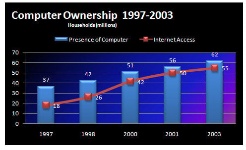
Don‘t apply background colors to the Chart area or Plot area. Colors in general should be reserved for key data points in your chart.
Don‘t use 3D charts or 3D effects. No one’s going to give you an Oscar for special effects. Nothing 3D belongs on a dashboard.
Don‘t apply fancy effects such as gradients, pattern fills, shadows, glow, soft edges, and other formatting. Again, the word of the day is focus, as in “Focus on the data and not on the shiny, happy graphics.”
Don‘t try to enhance your charts with clip art or pictures. They do nothing to further data presentation, and they often just look tacky.
Skip the unnecessary chart junk.
Charts with too many chart elements can become convoluted and hard to read. Removing the unnecessary elements clarifies the message.
Data visualization pioneer Edward Tufte introduced the notion of data-to-ink ratio. Tufte’s basic idea is that a large percentage of the ink on a chart or dashboard should be dedicated to data. Very little ink should be used to present what he calls chart junk: borders, gridlines, trend lines, labels, backgrounds, and other elements.
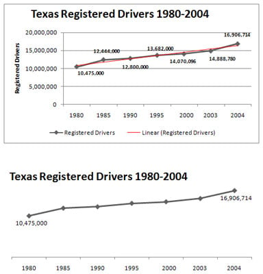
Remove gridlines. Gridlines (both vertical and horizontal) are almost always unnecessary.
Remove borders. You’ll find that eliminating borders and frames gives your charts a cleaner look and helps avoid the dizzying lines you get when placing many charts with borders on a single dashboard.
Skip the trend lines. Seldom does a trend line provide insight that can’t be gained with the already plotted data or a simple label.
Avoid data label overload. Nothing says that you need to show the data label for every value on your chart. It’s okay to plot a data point and not display its value. You’ll find that your charts have more impact when you show only numbers relevant to your message.
Don‘t show a legend if you don‘t have to. When you’re plotting one data series, there’s no need to display a space-taking chart legend.
Remove any axis that doesn‘t provide value. The purpose of the x– and y-axes are to help a user visually gauge and position the values represented by each data point. However, if the nature and utility of the chart don’t require a particular axis, you should remove it.
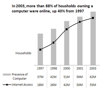
Format large numbers where possible.
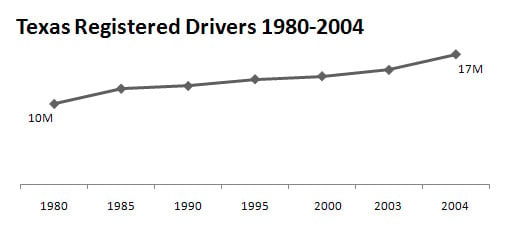
Formatting large numbers to millions or thousands makes for a clearer chart.
It’s never fun to count the zeros in a large number, especially when you’re staring at 8-point font. When plotting very large numbers on a chart, consider formatting the values so that they’re truncated for easy reading.
Use data tables instead of data labels.
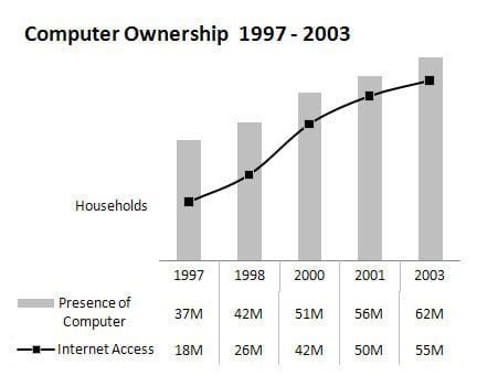
Data tables enable you to show data values without overloading your chart with data labels.
Sometimes it’s valuable to show all the data values along with the plotted data points. However, data labels can inundate users with chart junk. Rather than use data labels, you can attach a data table to your Excel chart. A data table allows you to see the data values for each plotted data point, beneath the chart.
Make effective use of chart titles.
Use chart titles to present extra layers of data without taking up extra space on your dashboard.
A chart title doesn’t have to be limited to simple labeling and naming duties. You can use a chart title to add an extra layer of information, presenting analysis derived from the data presented in the chart.
Sort your data before charting.
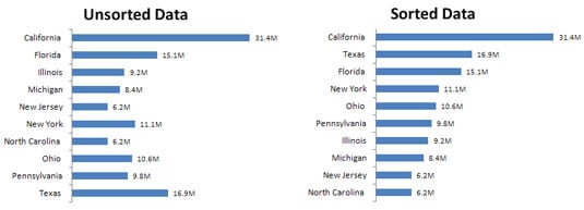
Using sorted data in a chart improves readability and clarity.
Unless there’s an obvious natural order, such as age or time, it’s generally good practice to sort your data when charting. Sort the source data that feeds your chart in ascending or descending order by data value.
Limit the use of pie charts.
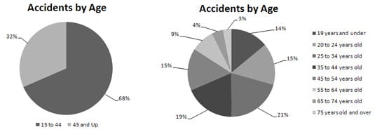
Although pie charts have long been considered a viable charting option for business reporting, they often aren’t well suited for dashboard reporting. There are a couple of reasons for this.
First, they typically take up more space than their cousins, the line and bar charts. Sure, you can make them small, but pixel for pixel, you get a lot less bang for your data-visualization buck with a pie chart.
Second, pie charts can’t clearly represent more than two or three data categories.
The pie chart on the left does a good job visually of representing two data categories. You can easily distinguish the two categories and clearly get a sense of distribution for each category. The pie chart on the right is a different story. As you can see, when you go past two or three categories, a pie chart isn’t as effective in relaying the proper sense of percent distribution. The slices are too similar in size and shape to visually compare the categories.
Don't be afraid to parse data into separate charts.
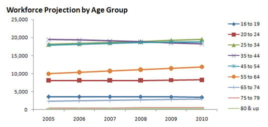
Be aware that a single chart can lose its effectiveness if you try to plot too much data into it.
This chart has a couple of problems. First, the data is split into nine age groups, which forces you to use nine lines. When you start plotting more than three lines on a line chart, your chart begins to look jumbled. Second, the age groups have a wide range of data values. This causes the chart’s y-axis scale to be so spread out that each line essentially looks like a straight line.
It’s not always easy to know exactly how to display your data in a chart — especially when the data is multilayered and complex. Rather than jam the world into one chart, step back and think about how to show the data separately but together.
Maintain appropriate aspect ratios.
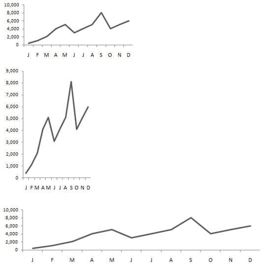
In terms of charts, aspect ratio refers to the ratio of height to width. That is to say, charts should maintain an appropriate height-to-width ratio in order for the integrity of the chart to remain intact.
A skewed aspect ratio can distort your charts.
The chart at the top is at an appropriate aspect ratio that correctly renders the chart. The bottom two charts display the same data, but the aspect ratios of these charts are skewed. The middle chart is too tall, and the bottom chart is too wide. This essentially distorts the visual representation, exaggerating the trend in the chart that’s too tall and flattening the trend in the chart that’s too wide.