In base R, it's easy to plot the ecdf:
plot(ecdf(Cars93$Price), xlab = "Price", ylab = "Fn(Price)")
This produces the following figure.
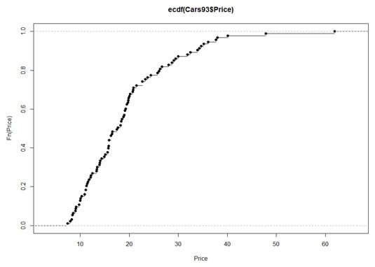
The uppercase F on the y-axis is a notational convention for a cumulative distribution. The Fn means, in effect, "cumulative function" as opposed to f or fn, which just means "function." (The y-axis label could also be Percentile(Price).)
Look closely at the plot. When consecutive points are far apart (like the two on the top right), you can see a horizontal line extending rightward out of a point. (A line extends out of every point, but the lines aren't visible when the points are bunched up.) Think of this line as a "step" and then the next dot is a step higher than the previous one. How much higher? That would be 1/N, where N is the number of scores in the sample. For Cars93, that would be 1/93, which rounds off to .011.
Why is this called an "empirical" cumulative distribution function? Something that's empirical is based on observations, like sample data. Is it possible to have a non-empirical cumulative distribution function (cdf)? Yes — and that's the cdf of the population that the sample comes from. One important use of the ecdf is as a tool for estimating the population cdf.
So the plotted ecdf is an estimate of the cdf for the population, and the estimate is based on the sample data. To create an estimate, you assign a probability to each point and then add up the probabilities, point by point, from the minimum value to the maximum value. This produces the cumulative probability for each point. The probability assigned to a sample value is the estimate of the proportion of times that value occurs in the population. What is the estimate? That's the aforementioned 1/N for each point — .011, for this sample. For any given value, that might not be the exact proportion in the population. It's just the best estimate from the sample.
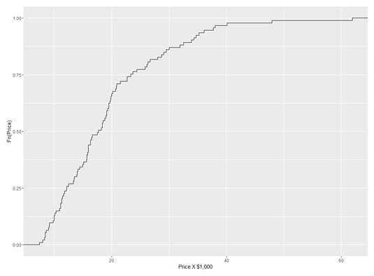
You might prefer to use ggplot() to visualize the ecdf. Because you base the plot on a vector (Cars93$Price), the data source is NULL:
ggplot(NULL, aes(x=Cars93$Price))
In keeping with the step-by-step nature of this function, the plot consists of steps, and the geom function is geom_step. The statistic that locates each step on the plot is the ecdf, so that's
geom_step(stat="ecdf")
and label the axes:
labs(x= "Price X $1,000",y = "Fn(Price)")
Putting those three lines of code together
ggplot(NULL, aes(x=Cars93$Price)) +
geom_step(stat="ecdf") +
labs(x= "Price X $1,000",y = "Fn(Price)")
gives you this figure:
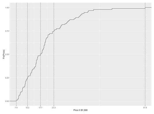
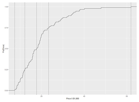
To put a little pizzazz in the graph, add a dashed vertical line at each quartile. Before adding the geom function for a vertical line, put the quartile information in a vector:
price.q <-quantile(Cars93$Price)
And now
geom_vline(aes(xintercept=price.q),linetype = "dashed")
adds the vertical lines. The aesthetic mapping sets the x-intercept of each line at a quartile value.
So these lines of code
ggplot(NULL, aes(x=Cars93$Price)) +
geom_step(stat="ecdf") +
labs(x= "Price X $1,000",y = "Fn(Price)") +
geom_vline(aes(xintercept=price.q),linetype = "dashed")
result in the following figure.
A nice finishing touch is to put the quartile-values on the x-axis. The function scale_x_continuous() gets that done. It uses one argument called breaks (which sets the location of values to put on the axis) and another called labels (which puts the values on those locations). Here's where that price.q vector comes in handy:
scale_x_continuous(breaks = price.q,labels = price.q)
And here's the R code that creates the following figure:
ggplot(NULL, aes(x=Cars93$Price)) +
geom_step(stat="ecdf") +
labs(x= "Price X $1,000",y = "Fn(Price)") +
geom_vline(aes(xintercept=price.q),linetype = "dashed")+
scale_x_continuous(breaks = price.q,labels = price.q)