
When you create a statistical time chart, you have to evaluate the units of the numbers being plotted. For example, it's misleading to chart the number of crimes over time, rather than the crime rate (crimes per capita) — because the population size of a city changes over time, crime rate is the appropriate measure. Make sure you understand what numbers are being graphed and examine them for fairness and appropriateness.
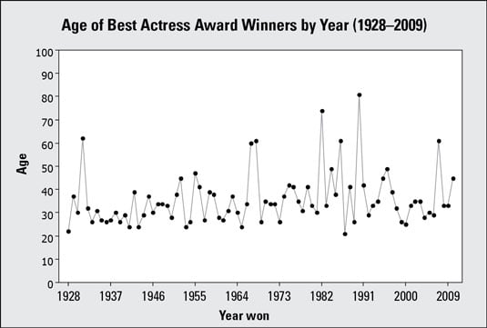
The scale on the vertical axis can make a big difference in the way the time chart looks. The above figure shows a time chart of the ages for the Best Actress Academy Award winners from 1928–2009 in increments of 10 years. You see a fair amount of variability.
In the figure, the starting and ending points on the vertical axis are 0 to 100, which creates a little bit of extra white space on the top and bottom of the picture. This example could have used 10 and 90 as the start/end points, but this graph looks reasonable.
Now what happens if you change the vertical axis?
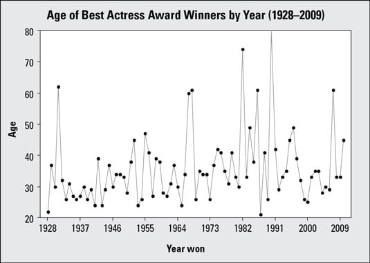
This figure shows the same data, with start/end points of 20 and 80. The increments of 10 years appear longer than the increments of 10 years shown in the first figure. Both of these changes in the graph exaggerate the differences in ages even more.
How do you decide which graph is the best one for your data? There is no perfect graph, and there is no right or wrong answer, but there are limits. You can quickly spot problems just by zooming in on the scale and start/end points.
Here is a checklist for evaluating time charts, with a couple more thoughts added in:
Examine the scale and start/end points on the vertical axis (the one showing the values of the data). Large increments and/or lots of white space make differences look less dramatic; small increments and/or a plot that totally fills the page exaggerate differences.
If the amount of data you have is overwhelming, consider consolidating the data by finding means/medians for blocks of time and plotting those instead.
Watch for gaps in the timeline on a time chart. For example, it's misleading to show equally spaced points on the horizontal (time) axis for 1990, 2000, 2005, and 2010. This happens when years are just treated like labels, rather than real numbers.
As with any graph, take the units into account; be sure they're appropriate for comparison over time. For example, are dollar amounts adjusted for inflation? Are you looking at number of crimes or the crime rate?