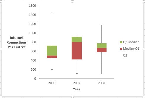
You represent each five-number summary as a box with “whiskers.” The box is bounded on the top by the third quartile, and on the bottom by the first quartile. The median divides the box. How you lay out the chart determines the width of the box. The whiskers are error bars: One extends upward from the third quartile to the maximum, and the other extends downward from the first quartile to the minimum.
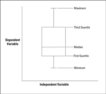
Notice that the median isn’t necessarily in the middle of the box and the whiskers aren’t necessarily the same length.
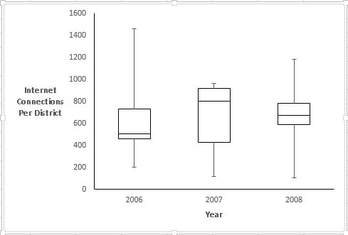
The first order of business is to put data into a worksheet and start computing some statistics. The following figure shows the worksheet and the statistics.
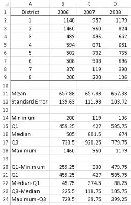
The next group of statistics holds the values for the five-number summary. You can use MIN to find the minimum value for each year, and MAX to find the maximum value. QUARTILE.INC computes the first quartile and the third quartile. Not surprisingly, MEDIAN determines the median.
The final group of statistics holds the values you put directly into the box-and-whisker plot. Why is this group necessary?
You can turn a Stacked Column chart into a box-and-whisker plot. In a stacked column, each segment’s size is proportional to how much it contributes to the size of the column. In a box-and-whisker box, however, the size of a segment represents a difference between one value and another — like the difference between the quartile and the median, or between the median and the first quartile.
So the box is really a stacked column with three segments. The first segment is the first quartile. The second is the difference between the median and the first quartile. The third is the difference between the third quartile and the median.
But wait. Won’t that just look like a column that starts at the x-axis? Not after you make the first segment disappear!
The other two differences — between the maximum and the third quartile and between the first quartile and the minimum— become the whiskers.
Follow these steps after you calculate all the statistics:
-
Select the data for the boxes in the box-and-whisker plot.
In this worksheet, that’s B21:D23. Rows 20 and 24 don’t figure into this step.
-
Select INSERT | Recommended Charts, and then select the sixth option to add a stacked column chart to the worksheet.
The fourth option in the Recommended Charts is also a stacked column chart. Don’t select that one. Its rows and columns are reversed.
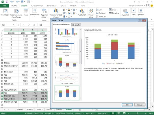
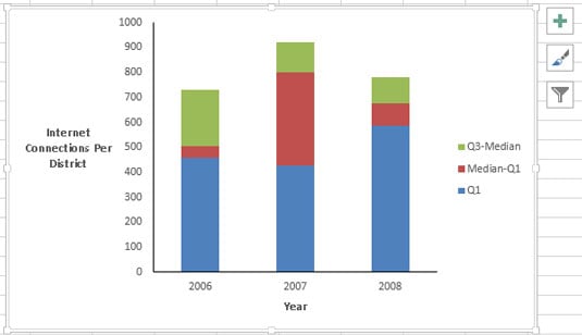
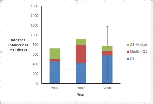
The following figure shows what the stacked column chart looks like after you insert it, delete the gridlines, move the legend, remove “Chart Title,” and reformat and title the axes. The figure also shows the chart toolset to right of the chart.
-
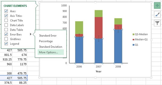
Add the whiskers.
First, add the lower whiskers. With the bars corresponding to Q1 selected (the lowest portion of each stacked column), click the Plus Sign in the chart toolset. From the pop-up menu that appears, select the Error Bars check box, and then the arrowhead to the right of that option. From the resulting menu, select More Options.
This opens the Format Error Bars panel. Select the Minus radio button, the Cap radio button, and the Custom radio button.
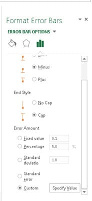
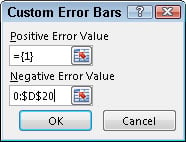
Then click the Specify Value button to open the Custom Error Bars dialog box. Leaving the Positive Error Value as is, specify the cell range for the Negative Error Value. For this worksheet, that’s B20:D20 (Q1-Minimum).
-
Clicking OK closes this dialog box, and clicking the Close symbol closes the Format Error Bars panel.
Follow similar steps to add the upper whiskers. This time select the part of the stacked columns corresponding to Q3-Median (the upper portion of each stacked column). Then as earlier, click the Plus Sign in the chart toolset.
Again, select the box next to Error Bars in the pop-up menu, and the arrowhead to the right of that option. This time in the Format Error Bars panel, select the Plus radio button, the Cap radio button, and the Custom radio button.
Again, click the Specify Value button to open the Custom Error Bars dialog box. This time, specify the cell range for the Positive Error Value. That cell range is B24:D24 (Max-Q3). Click OK and Close.
-
Make the bottom segments disappear.
To give the appearance of boxes rather than stacked columns, select Q1 (the bottom portion of each column), then right-click and choose Format Data Series from the pop-up menu to open the Format Data Series dialog box.
In the Format Data Series panel, click Fill (the bucket icon), and in the Fill area select the No Fill radio button. Then in the Border area, select the No Line radio button.
Clicking Close closes the Format Data Series panel.
-
Reformat the remaining series to complete the box-and-whiskers plot.
Select Median-Q1 (the portion that now appears to be the lower part of each column), right-click and pick Format Data Series from the pop-up menu. In the Format Data Series panel, select Fill and select the No Fill radio button in the Fill area. Then select the Solid Line radio button in the Border area.
Next select Border Color and select the Solid Line radio button. Click the Color Button and select black from the Theme Colors palette.
Finally, select Q3-Median (the upper portion of each column), and then go through the same sequence.
After that, delete the legend. You can add another data series that shows where the means are, and another that would allow me to connect the medians, but this is enough for now.
Notice that after you finish working with the Format Data Series panel for one data series, you can leave it open. Then select another data series in the chart and start formatting it. Unlike earlier versions of Excel (that worked with dialog boxes rather than panels), you don’t have to close the formatting panel and reopen it each time you want to format a data series.