The idea of a line graph is to show how a value changes in response to another value – often, but not always, time.
Here is an example of a line graph showing the world population. Notice the zigzag on the vertical line – or axis, showing that the numbers don’t start at zero. At first glance, it looks like the population has doubled, but in fact it’s ‘only’ increased by about 20 per cent.

Careful with those axes!
Graphs are supposed to make data easier to visualise and understand – and, to a large extent, they do. But obtaining precise data from a graph is still sometimes tricky.Here’s the process for reading a line graph when you know a value on the horizontal axis:
-
Find the relevant value on the horizontal axis.
The value may be marked. If it’s not, try to estimate where the value should be: find the two values it sits between and decide which one it’s closer to. Make a little mark on the axis there.
-
Using a ruler, lightly draw a straight line in pencil directly up from the mark until it reaches the graph.
-
Now turn the ruler a quarter-turn and draw (still lightly in pencil) across from where your vertical line meets the graph, until you reach the vertical axis.
-
Where this line meets the vertical axis is your answer.
If the line is on a marked value, fantastic – that’s your answer. If your line doesn’t quite sit on a marked value, do a bit of inspired guesswork. Which values is your line between? Is it about halfway between them, or closer to one than the other?
Make your marks lightly in pencil because you may need to look at the graph again to find more values.
If, instead, you have a value for the vertical axis, you simply work the other way around: you find the value on the vertical axis, draw across to the graph, and then draw down to the horizontal axis, where you read off the value you need.More than one line
Sometimes you have two or more lines to work with. You read the values off the graph in the same way as for a graph with one line. The only difficulty is making sure you use the correct line.Before you start, look for the key or legend – a little area containing information about the graph. The key shows what the different colours or styles of line represent. Your mission is to pick the line that best suits what you’re looking for.
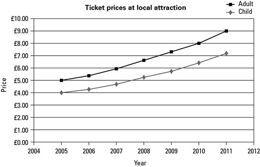
Line graph changes
A line graph shows the change from one time period to the next really well. If the graph slopes up and to the right, the value is increasing. If the graph slopes down and to the right, the value is falling.Try remembering that upright citizens are held in high regard, while downright dirty dogs are held in low esteem.
Here’s how to work out by how much a value has risen or fallen between two time periods:-
Read the value for the first time period on the horizontal axis.
-
Read the value for the second time period in the same way.
-
Take the smaller number away from the bigger number.
-
If the value has fallen, put a minus sign in front of the number.
The answer is how much your value has risen or fallen.
In a multiple-choice exam, read graph questions very carefully. Examiners are often sneaky and put in positive and negative versions of the same number. Make sure you get the sign right!